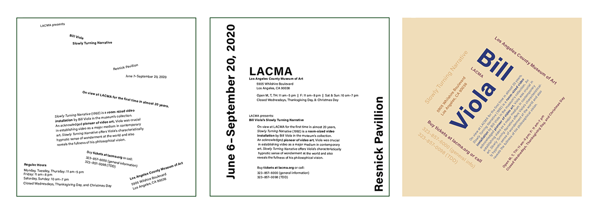
Typographic Hierarchy Posters
Experimented with multiple ways to demonstrate hierarchy and reading order. The event referenced is an exhibition at the Los Angeles County Museum of Art featuring Bill Viola's Slowly Turning Narrative.
Poster One (left): one point size, two weights, two styles, black & white
Poster Two (middle): two point sizes, two weights, two styles, black & white
Poster Three (right): any number of point sizes, weights, styles, colors

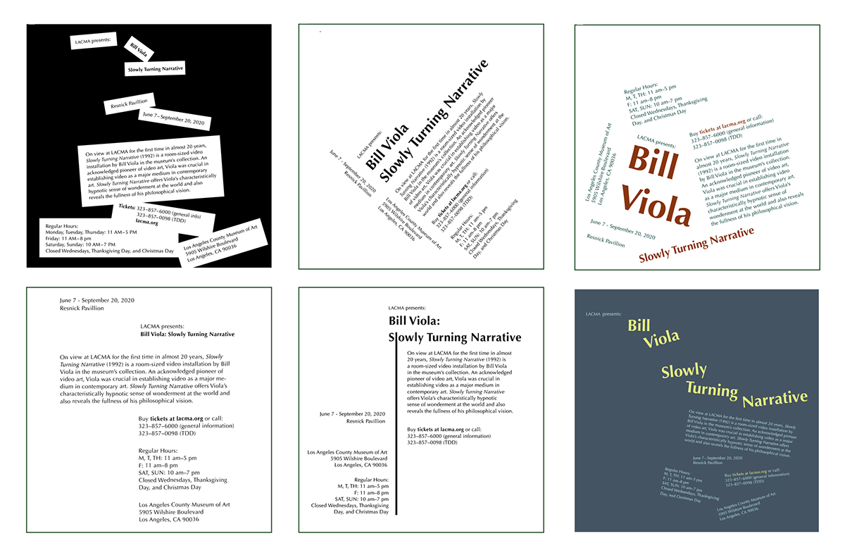
Process
Sketches
I started by trying a handful of typographic systems to arrange information. I kept targeting the artist's name and project title as the focal point of every sketch instead of experimenting with different typographic hierarchy.

Rough Drafts
The limitations of poster one challenged me to use style and weight appropriately to make specific information stand out. In poster two and three, I had more freedom but was still too focused on the artist name and project title.
Final Posters
I removed the black background from poster one because it distracted from the text. I chose a random typographic system of the text falling into place to reference movement, like the title of the exhibition. I rearranged the information of poster two because I wanted each of my posters to have different typographic hierarchy. Poster three was also completely rearranged so it didn't share the same typographic system as poster one. Blue was chosen as the dominant color to reference the exhibitions connection to water, and paired with warm colors to reference the hotter elements shown in the artist's other work.